place to sub/pub events
["{\"ln\":0,\"ch\":2,\"length\":12,\"id\":\"TX0-0\"}","{\"ln\":1,\"ch\":0,\"length\":1,\"id\":\"TX1-0\"}","{\"ln\":2,\"ch\":3,\"length\":10,\"id\":\"TX2-0\"}","{\"ln\":3,\"ch\":0,\"length\":54,\"id\":\"TX3-0\"}","{\"ln\":4,\"ch\":4,\"length\":5,\"id\":\"TX4-0\"}","{\"ln\":5,\"ch\":0,\"length\":79,\"id\":\"TX5-0\"}","{\"ln\":6,\"ch\":4,\"length\":10,\"id\":\"TX6-0\"}","{\"ln\":7,\"ch\":0,\"length\":54,\"id\":\"TX7-0\"}","{\"ln\":8,\"ch\":4,\"length\":6,\"id\":\"TX8-0\"}","{\"ln\":9,\"ch\":0,\"length\":47,\"id\":\"TX9-0\"}","{\"ln\":10,\"ch\":4,\"length\":10,\"id\":\"TX10-0\"}","{\"ln\":11,\"ch\":0,\"length\":56,\"id\":\"TX11-0\"}","{\"ln\":12,\"ch\":3,\"length\":18,\"id\":\"TX12-0\"}","{\"ln\":13,\"ch\":0,\"length\":48,\"id\":\"TX13-0\"}","{\"ln\":14,\"ch\":4,\"length\":8,\"id\":\"TX14-0\"}","{\"ln\":15,\"ch\":0,\"length\":109,\"id\":\"TX15-0\"}","{\"ln\":16,\"ch\":4,\"length\":8,\"id\":\"TX16-0\"}","{\"ln\":17,\"ch\":0,\"length\":110,\"id\":\"TX17-0\"}","{\"ln\":18,\"ch\":3,\"length\":9,\"id\":\"TX18-0\"}","{\"ln\":19,\"ch\":0,\"length\":112,\"id\":\"TX19-0\"}","{\"ln\":20,\"ch\":3,\"length\":15,\"id\":\"TX20-0\"}","{\"ln\":21,\"ch\":0,\"length\":136,\"id\":\"TX21-0\"}"]
Typography-1
—


Font types
Most fonts fall into one of four different font types.
Serif
Serifs are the small lines and hooks at the end of the strokes in some letters.
Sans serif
Sans means “without.” A sans serif font has no serifs.

Script
Script typefaces use a flowing, cursive stroke.

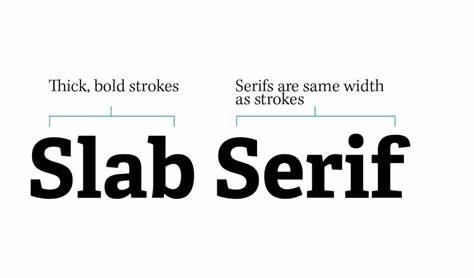
Slab serif
Slab serif is distinguished by thick, block-like serifs.
Components of type
All fonts are made of the same basic components.
Ascender
An ascender is the part of a lowercase letter that rises above the main body of the letter. Think “b” or “h.”

Baseline
All font characters sit on the baseline, the lowest point of all uppercase letters and most lowercase letters.

Descender
A descender is the part of a lowercase letter that descends below the main body of the letter. Think “g” or “p.”

Median/x-height
The median or x-height is where most lower-case letters should reach their maximum height. It is set from the height of the x in a font.